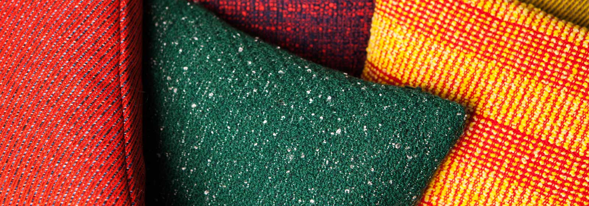


Exploring Classic Blue: Pantone’s Colour of The Year 2020
In 1999, Pantone announced their Colour of the Year as Cerulean — a soft turquoise that embodied the excitement and nerves of a new Millenium. 20 years later, its given way to Classic Blue, a shade as elegant and ethereal as the sky at dusk. Less intense than the indigo we introduced in August, it seeks to embody the stability that has been missing from our political landscape. Rhetoric aside, it makes for gorgeous styling — adding gravity and poise to contemporary interiors. In today’s blog, we reveal three ways to incorporate Classic Blue into your home this season…
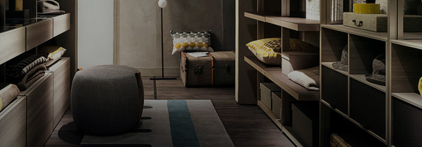
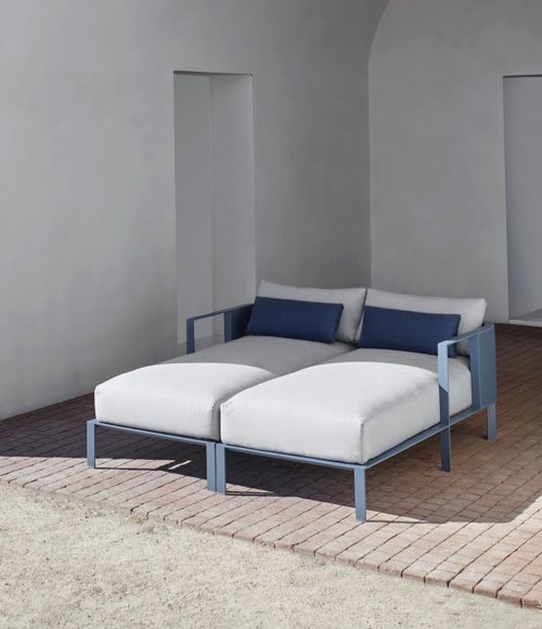
Santorini Scheming
Leatrice Eiseman, Executive Director of the Pantone Colour Insitute, has described Classic Blue as the epitome of elegance and simplicity. One tip when decorating is to treat it as such, opting for a pared-back palette of white and blue. Less piercing than your traditional azure hues, Classic Blue imbues nautical schemes with a new gravitas and depth, a subtle shift that feels apt for cooler climes. In limiting your palette to just a couple of colours, you help create a sense of cohesion and clarity — an ideal backdrop for more eccentric styles.
“Instilling calm, confidence, and connection, this enduring blue hue highlights our desire for a dependable and stable foundation on which to build as we cross the threshold into a new era.”
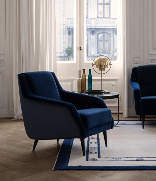
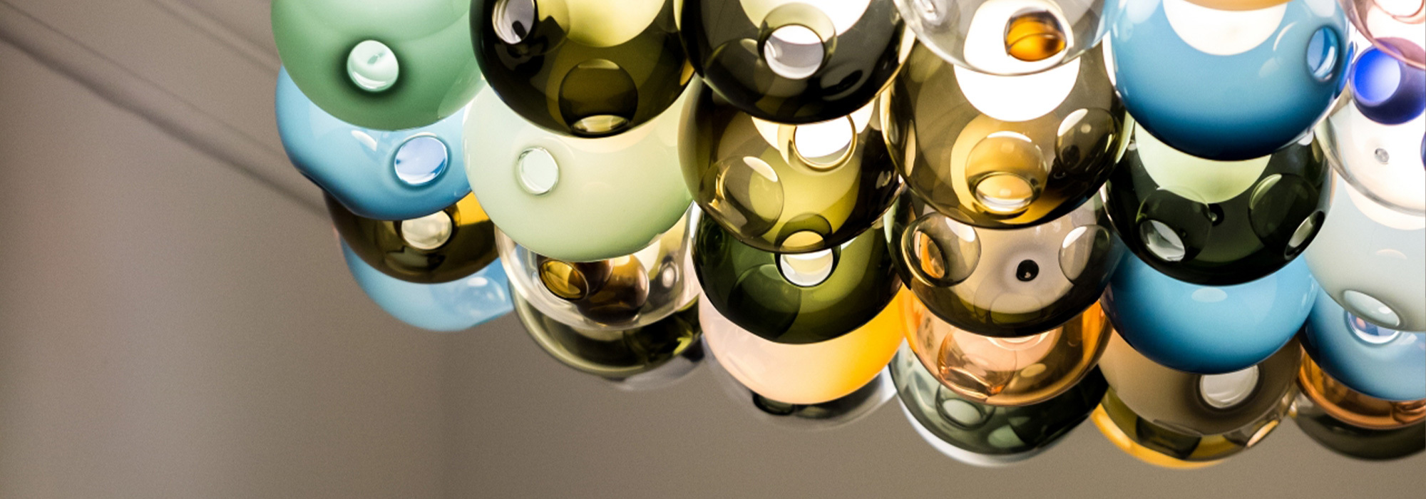
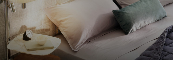
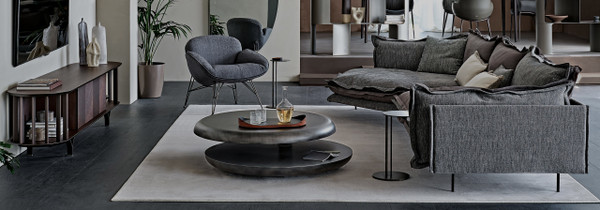
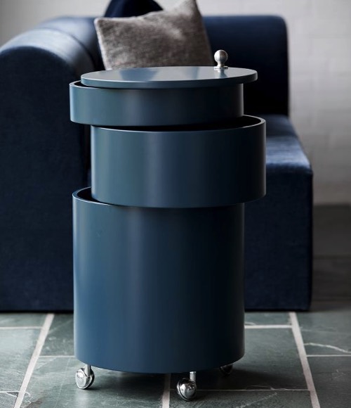
Make A Splash
In nature, blue is expansive and versatile, a source of optimism, power and intrigue. The more adventurous will want to explore these qualities, opting for Classic Blue feature walls and blue-on-blue bedrooms. In the image above, Pantone’s hue acts as a stabilising foundation for a wide spectrum of blues, creating an atmospheric yet restful space. Irridescent furniture also tends to work well within such schemes, with Bonaldo’s Shade Sideboard used to create luminous light effects.
“Imbued with a deep resonance, Classic Blue provides an anchoring foundation. A boundless blue evocative of the vast and infinite evening sky, Classic Blue encourages us to look beyond the obvious to expand our thinking.”
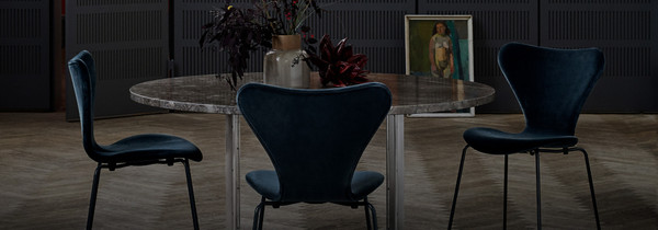
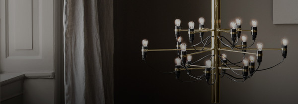
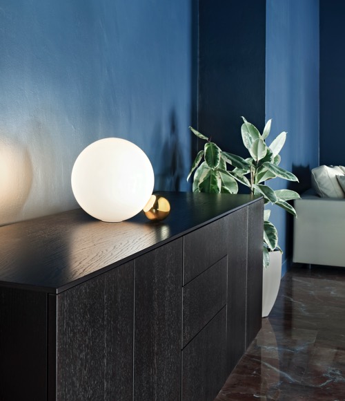
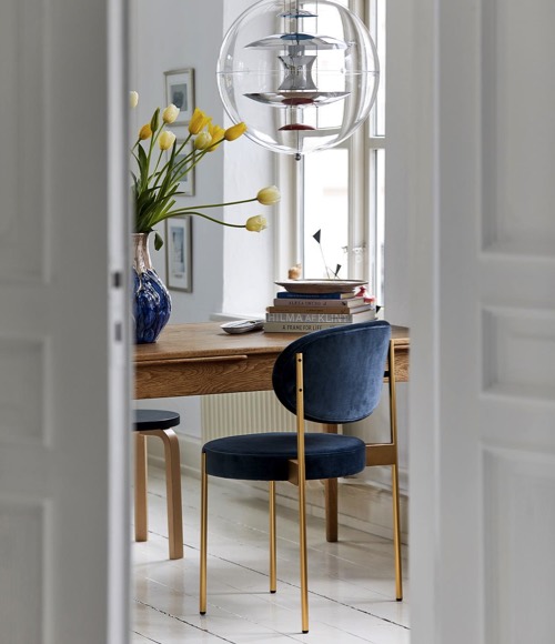
Gilty Pleasures
Metallic accents are another perfect partner for Pantone’s Classic Blue. These can be as sparing or as all-encompassing as you like — as simple as a brass chair leg or gold leaf wall light. Taken together, they promise to add warmth and radiance to dusky schemes.
“As technology continues to race ahead of the human ability to process it all, it is easy to understand why we gravitate to colours that are honest and offer the promise of protection. Non-aggressive and easily relatable, Classic Blue lends itself to relaxed interaction. Associated with the return of another day, this universal favourite is comfortably embraced.”
SHOP CLASSIC BLUE DESIGN ONLINE OR IN-STORE IN THE CHAPLINS WINTER PROMOTION