Fritz Hansen: Unmuted Minimalism
Colour – it's here, and we're rejoicing! Pigment has taken over the contemporary home, covering surfaces and dancing through rooms with its glorious joy de vivre and power to elevate atmospheres and moods. Be it a chromatic chair, a bright light or a vivid vase, chunks of colour in every size and shade are now permanent fixtures in our spaces, bringing smiles and moments of pure pleasure to life indoors.
Colour Collision
But how to work this new kaleidoscopic disposition into our existing aesthetic? We've long been building calm, cool, collected minimal interiors, often with a distinctly Scandinavian edge – do our beloved pale woods, worn leathers and calm, forest- inspired hues work with these new flashes of fuchsia, smatterings of scarlet and pops of periwinkle? The answer is yes, yes, a resounding yes – and heritage Danish design brand Fritz Hansen is showing us how to bring the two together while maintaining that characteristic Scandi cool.
In Vogue
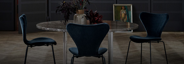
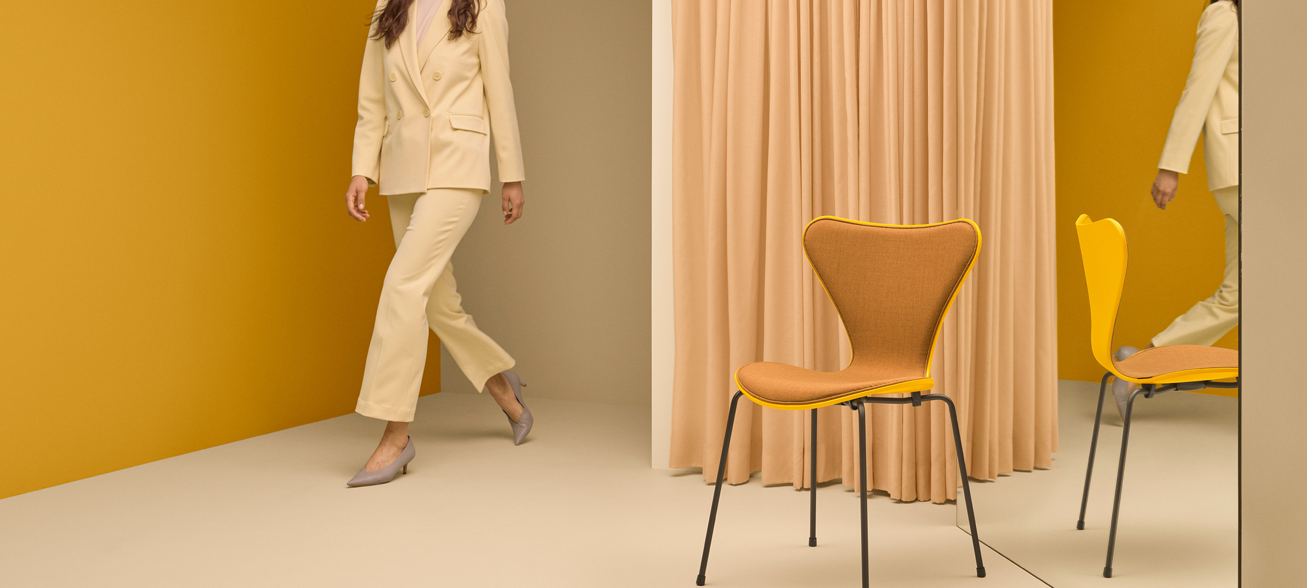
Fritz Hansen's soul-enriching spectrum of shades has been crafted by an expert editorial eye, that of Italian magazine editor, gallerist, entrepreneur and all-round creative virtuoso Carla Sozzani. The curated 16-piece colour collection features vibrant hues as well as the more tonal, from bold True Yellow and Paradise Orange to soothing Dusk Blue and Pale Rose and rich Venetian Red and Burnt Yellow. Formulated especially for the beloved silhouettes of the Ant, Series 7 and Grand Prix chairs by Danish icon Arne Jacobsen, Fritz Hansen's hues lead the way in introducing timeless colour to modern, Scandinavia-inspired home tones.
Organic influences
As well as the bold, the Fritz Hansen palette is also infused with classic Nordic neutrals which all seem touched by nature, such as Deep Clay, Light Beige, Olive Green and Nine Grey. The muted nature-tinted tones slide easily into modern spaces already filled with subdued stony, sandy, snowy and stormy shades, allowing the more pigmented side of the collection to smoothly integrate into the room to build a colourful yet distinctly Scandi interior landscape.
The Evolving Ant
An enduring symbol of mid-century Danish furniture design, the Ant chair was conceived in 1952, its curved seat made from a revolutionary innovation – a single piece of moulded veneer. Now released with an upholstered front shell, the historic contours have metamorphosed, emerging butterfly-like in radiant shades of textile that add new life to the world-renowned form and paving the way for a tonal collaboration with the rainbow.
Leading Light
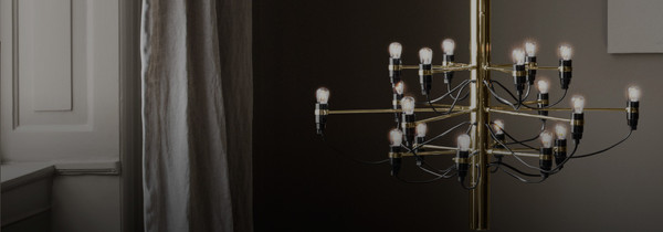
Similarly, the Fritz Hansen Kaiser Idell lighting collection also harnesses a fresh finish to carry it into the world of colourful contemporary interiors. Created by Christian Dell in 1936, the lights are a symbol of iconic Bauhaus design, their geometric forms, precise engineering and uncluttered style pointing directly to progressive Modernism. Originally available in dark, moody tones, when coated in cheerful new finish Ruby Red, the lamps become more friendly and accessible – a 2020s spin on 20th century avant-garde. The gravitas and historic significance of the Fritz Hansen Kaiser Idell easily grant it the authority to invite colour into the home, the enduring icon reflecting ultramodern Nordic sensibilities via a sophisticated splash of scarlet.
Colouring The Classics
A tip to bringing brightness into the muted Denmark/Stockholm/Oslo/Helsinki-infused homes we've so lovingly nurtured? Look to the region's existing accomplishments to move forward. Legendary Scandi design objects have the power to merge classic Nordic style with unexpected colours, effortlessly mixing into contemporary collections with their recognisable, time-honoured forms and creating new technicoloured timelines.
Inspired by the collection of colourful classics Fritz Hansen has to offer? Discover their full collection here


