Milan Trend Report 2024
Installations, interiors, exhibitions, energy, furniture, frolics. Yes, it’s the Salone del Mobile furniture fair and Milan Design Week 2024. With the Milanese streets abuzz with excitement, it’s where luxury interior design and theatricality collide. From immersive installations – exhibits to climb through, light shows set to music, rooms focused on smell and mood, usually-off-limit buildings to explore – furniture found new and creative ways to wow us.
This one week in Milan is what the interiors elite and every designer furniture brand has been waiting for, the showcase forming a compass pointing to how we’ll be living for the next 12 months, as well as where the design world is headed longer term. Last year it was all about pigment, colour and being bold. Textures went wild and shapes took a turn for the whimsical. Interior design became all about making us and those in our home smile.
For 2024, the interior design trends are all about... not being trends. Throwaway fads were dismissed as brands focused on improving on their existing lines, exploring timeless materials and forms, and leaning into nature. While trends were out of the window, there were gentle themes to be spotted (if you looked very hard) – natural(ish) and simple colours and tones were on the rise – shades that will weather decades rather than seasons. It was with texture that things got more unusual, and shape was comforting and honest as well as light-hearted. Welcome to the interiors of 2024, where the long-lasting, thoughtful design meets winks of playfulness and the experimental.
The Hues
Deep Reds
Dive into the full-bodied richness that dominated this year’s Milan showrooms; fruity burgundy/cherry/oxblood shades that feel intense and energising as well as muted and elegant at the same time.
The colours came in all guises, from gleaming lacquer and please-tell-me-where-your- quarry-is heavily veined marble alongside upholstery, glass and more, carried best on forms that were simplistic to let the rich pigment lead the way and set the tone in stone.
Rust
The neutral colour for decorating in 2024? A warming palette of earthy tones that are a little more gold and lighter than last year’s terracotta-y shades, heading more towards natural rust. Seen used as textured, literal rust interpretations as well as on fabrics and the flatter materials, the hues nod to nature – bringing the outdoor in is forever fresh – as well as being a friendlier, more immersive alternative to grey.
Working smoothly alongside timber, the tones of caramel, nuts and chocolate have a delicious richness to them, playing on the classic 70s palette while bringing a natural warmth, a sense of subtle indulgence and a grounding calmness into the modern home.
Monochrome Moments
Following hot in the footsteps of the catwalk and fashion world, moments of simple colour-blocking filled the streets of Milan as well as the stands of Salone Del Mobile 2024.
How to move it into the home? Well, the rules have relaxed from the days of hardcore colour drenching, and this time neutrals as well as different tones are in on the action. There’s no rule in term of brightness, with spaces spanning the natural – a milky latte here, a pale cashmere there – to the all-out vivid, be it soothing terracotta orange or wake-up sunshine yellow.
Does it all have to match? It can. But it doesn’t need to. Whether it’s a pick n mix of your favourite tonal earthy shades, or a considered all-over colour soak, now it’s about the feeling of envelopment the colours create rather than their Instagram-ability.
Allow colours and shades to co-ordinate gently, as if – almost – by accident. This is laid-back coordination. Feel that palette surround and embrace you.
The Finishes
Bouclé & Beyond
Quietly luxurious bouclé reigned over furniture and fabrics in 2023, and while there’s still plenty of those creamy white loops to be getting on with (the most covetable pieces dressed in only the ultra-thick), 2024’s upholstery fabrics are taking it one step further.
The most progressive brands are going teddy, dressing their soft furniture with thick fleece-y coats, while beyond that sparkles the Minerals project by Edra, blending a plush feel with exquisite clarity. With custom-dyed materials making up the mineral effect, Edra leaves no stone unturned in their quest to bring brilliance to their bouclé. The effect? Hyper cosiness, and the very real threat that you won’t be able to get up from that chair that you just curled up in.
Lacquers
‘Shinier, glossier, more polished!’ yelled the walkways of Salone del Mobile, and the designers delivered, with hard furniture from dining tables to storage covered in layers of practically mirror-like brilliance at every turn. How does lacquer impact a space? It turns any object into a sculpture, a working reflection-distorting piece of art that draws all eyes in.
Long associated with extravagance and elegance, lacquered furniture has a history of making an impact indoors. This year, lacquered furniture is all about contrast; classic tones such as iconic deep red and dark bottle green are being combined with experimental, contemporary forms, the designs standing monolith-like within a room, awaiting discussion and admiration alike.
Tempered Textures
We dabbled in textured glass last year; this year, the furniture world is showing us how it’s done. Glass has become almost unrecognisable. There’s watery glass that seems to move as if shaped by wind or a movement of the earth, irregular glass that comes together as if still soft, glass that seems to be a still-growing natural material, glass that looks like it’s shattered, opaque glass, striped glass, coloured glass – many, many different types of glass that seem to be only very distant cousins to the strict linear panes we’re used to seeing. Then there’s metal that has similarly metamorphosed, with hammered surfaces taking to the fore with aplomb this year.
The result is all about light and how it moves – bounce or reflect it in some unexpected way and a layer of mystery, ethereality and whimsy is created. Are these new materials? It really feels like they are.
The Shapes
Exo-Skeletal
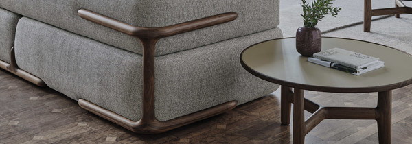
Last year we noticed that frames had slowly creeped onto the outside of many furniture pieces: now, they’re fully fledged features. Metal frameworks have grown personalities, presented in bold colours, supersized thicknesses or artistic shapes, becoming finishing flourishes to sofas/chairs/tables as well as something that physically makes it all work. This transformation is a modern, light-hearted (sometimes mischievous) take on the industrial, lending a practical side to designs where creative form and structure intertwine. Whether they serve a utilitarian purpose or exist simply for aesthetic flair, they remind us of the careful construction that goes into every piece in the home – as well as make us feel extra secure.
Perfect Imperfection
Last year, many pieces of furniture took a turn for the geometric and mathematical perfection. This year, things are moving in the opposition direction, with organic curves, pebble-like roundness and uneven wavy shapes gaining momentum. Circles seem to have been drawn by hand and three-dimensional shapes have a just-sculpted feel – irregularity is here.
Is this the pull of nature? Such forms – those that could have grown in the forest or formed slowly over time – are deeply imbued with peacefulness and a sense of tranquillity. Their gentle curves and irregular contours mirror naturally occurring forms – rolling hills, flowing rivers, leaves and petals – allowing us to momentarily escape the rigidity of modern life and find solace in nature's design.
Padded Pillows
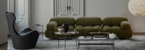
Get ready to sink into unadulterated comfort – contemporary furniture is getting super- stuffed. This year’s design cohort of chairs, sofas, footstools, tables and more are voluptuous, curvy designs that aren’t skimping on materials. From cushions on seating that seem over-filled, plush and puffy to generously shaped hard furniture, this design movement tells the story of cosiness and relaxation where more is oh-so more.
Each piece is outrageously tempting – you can practically feel it enveloping you before you’ve even begun to take a seat. They’re soothing. Welcoming. Each piece is a sanctuary – nothing and no one can get you (possibly even find you) when you’re nestled safely in these soft, cocooning embraces.
Product Spotlights
Sofa: DS-888 - DeSede
Enter next level seating flexibility. Following visually in the footsteps of its much celebrated predecessor the 1972-designed DS-600, the DS-888 is similarly snake-like and curvaceous thanks to a set of thin segments. What’s new, is the backrest – able to move in multiple directions, the recurrent upholstered ridges can each be customised in height and angle to create individual head and neck support, as well as innovatively sliding along the modular base to be positioned as needed. “With the DS-888 Collina, we wanted to redefine the limits of what is possible with a modular design and achieve a seating landscape that stands out with its versatility, ergonomics and sophisticated aesthetics” Monika Walser, CEO of de Sede Created for use inside and out, the interior sofa is upholstered in premium leather on a high gloss chrome or satin black base frame, while the weatherproof outdoor models are wrapped in durable fabric developed by Kvadrat and The Romo Group on stainless steel frames in finishes such as black silk matt or white silk gloss.
Table: Isos Dining Table - B&B Italia
Evoking a delicate sense of transparency and visual slightness, the Isos table is at once light and heavy. Combining simple, natural materials with precise and thoughtful design details, the bevelled cylindrical legs make the surface top feel as if it’s about to start floating, as if the entire piece hangs in a careful balance, while its rounded edges create a sense of softness and gentility.
"The Isos table has legs cut at 35 degrees. As if it were a pencil, I pointed the legs at the nook where the tops rest on them to lessen the impact and to exaggerate their static and architectural quality. The interesting thing is the tension that is built between these pencils/columns and the top." - Piero Lissoni
Made from a variety of natural materials, the glass topped table comes with legs in black Marquina and white Carrara marble (every leg extracted from the same block of marble to have coordinating veins and colours) as well as oak in finishes from light to black and grey, as well as having an all-wood option. The table top spans round, oval, and rectangular forms, with three, four or six asymmetrically positioned legs.
Chair: Ginkgo Chair - Porada
Inspired by the forms of nature, most notably its namesake the fan-like split-in-the- middle gingko leaf, the Gingko chair consists of two halves; the smooth leather outer shell and the soft inner seat, all supported by a solid canaletta walnut frame in classic Porada style.
Created by up-and-coming designer Niccolò Devetag, the chair was the winning entry to Porada’s International Design Award 2022, and has now won the ultimate prize of joining the brand’s Twenty Twenty-Four collection.
The piece is highly customisable, with an array of textile options and finishes. Both upholstery sections are minimally decorated with stitching and piping, emphasizing the shell’s leaf-like form and each section’s shapely silhouette as well as showcasing the brand’s exquisite craft and making skill.
Storage: Z24 Cabinet - Zanotta
Comprising a series of storage furniture – a sideboard, a bedside table and two low containers – the Z24 collection by Muller Van Severen is focused on light and shadow. A fusion of function and the sculptural, the architectural corrugated-shaped front is a story of contrasts, one half of the zigzags picking up on light while the other sections sit in darkness.
"We are truly happy and excited about our collaboration with Zanotta. We share the love for the essence of design and authentic emotions, and we decided to design a series of storage furniture where the interaction with light and shadow is the most important aspect." - Fien Muller and Hannes Van Severen, Muller Van Severen.
Finished in laminated wood and matte lacquer, the design collects light, presenting it as reflection-less and flat. Available in the brand’s new colour palette, the storage pieces come in Talc, Wax, Hemp, Caramel, Orange, Amaranth, Grass Green, Espresso and Black. Inside sit adjustable shelves in tempered plate glass, with optional internal LEDs.
Accessory: Rigadino - Cassina
With that iconic Urquiola touch of avant garde elegance, the Rigadino rug is playfully irregular and seemingly simple. Inspired by historic Venetian glass makers, the design interprets the traditional striped motif typical of Murano glasswork in 100% wool, its heavy outline adorned with the characteristic black lines of the "rigadin" glass technique which creates a textured appearance with ribbed or ridged lines.
Created in a set of four unconventional colour combinations, Rigadino comes in amethyst with a swirling lemon-yellow outline, sea teal with a carrot red outline, topaz with periwinkle outline and ‘bluino’ light blue with a petroleum green outline.


