


Valentine's Day Special: The Unlikely Couples
It's Valentine's day, so it would be wrong for us not to talk about a few of our favourite furniture matches. Interior design is the love language of many and, for some, a powerful way to communicate emotion. But how do we craft a space that brings together two objectively contrasting styles? The unlikely couples of the design world, if you will — genres you’d never expect to see side by side. Until you do. And then you wonder: how could it possibly work any other way?
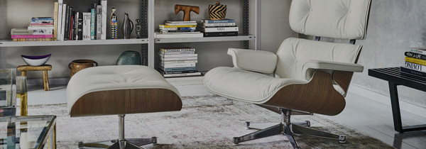
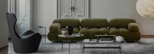
Aesthetic - Contemporary Meets Classic
We learn a great deal from history. One such lesson is how to blend the styles of yesteryear with the aesthetics of today. This match made in furniture heaven is all about timing — specifically the 1700s and the present day. That’s right: it turns out the designers of the 18th and 21st centuries have surprisingly complementary tastes. The exquisite attention to detail of the past pairs beautifully with the bold statements of modernity. Together, they tell a story that spans decades and prove that true style is, indeed, timeless.
Cassina / Edra Collections
Camaleonda Sofa by B&B Italia
AJ Floor Lamp by Louis Poulsen
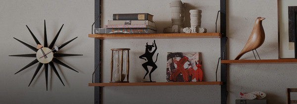
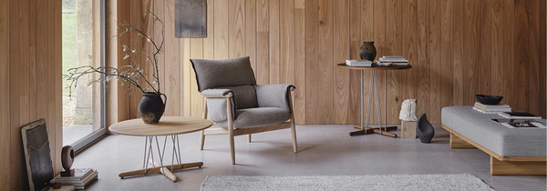
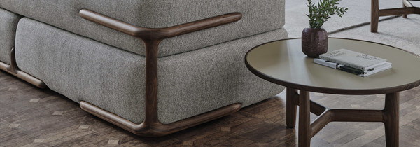
Materials - From Cane to Cararra
Materials are one of the easiest elements to pair — largely because nature does the hard work for us via its natural palette. The beiges of bouclé and beech, the steely dynamism of burnt oak and black glass, harmonious combinations that feel instinctive. But what happens when two materials share no obvious visual characteristics? Take the natural, free-flowing weave of rattan and the strong, immovable presence of marble. An unlikely duo — or Shakespearean leads?
Bringing together two of nature’s most distinctive contributions to interiors is surprisingly effortless and delivers striking results. The stone anchors statement pieces, such as a marble dining table or coffee table, creating a clear focal point, while rattan introduces a lighter, more flexible layer — stylish rattan seating that can be positioned and reimagined around the centrepiece as the space evolves.
Gubi Collection
PK15 Dining Chair by Fritz Hansen
MR Side Chair - Rattan by Knoll
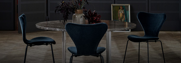
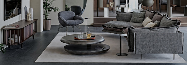
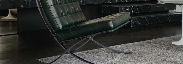
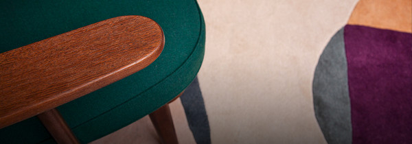
Colour - Moody Meets Muted
The most important arrow in an interior designer’s quiver is the ability to make the right choices when it comes to colour and its presence within a space. How much of each tone? What goes where? Which room needs more? Darker or lighter? That final question is our focus here. Add too much of either and a room can feel underwhelming or overwhelming. A subtle balance of both, however, is where the magic happens. Take a rich, deep, passionate hue and pair it with the delicate undertones of a pastel palette. The result? A rollercoaster of colour — but without the jarring surprises or sharp visual clashes that can unsettle an entire room.
Cornaro Sofa by Cassina
Hi Lo Sofa by &Tradition
Ploum by Ligne Roset
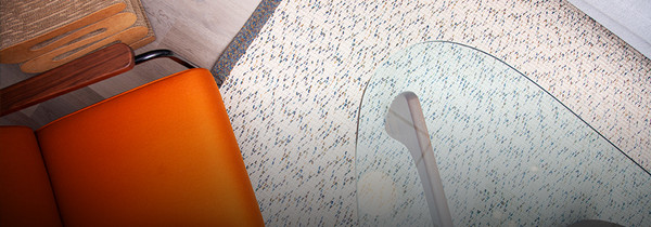
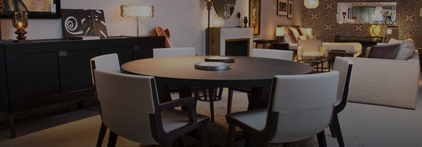
Showroom - Curated Contrasts
Our showroom is where the lines between even the most contrasting designs begin to blur. A space in constant evolution, it showcases the latest trends, releases and styles while still housing a museum-worthy collection of interior icons. With over 180 featured brands and more than 30 years as one of London’s premier design destinations, our store has always held one principle at heart: no matter where it’s from, who it’s by, or what the concept may be — if it’s bold, brilliant, or a compelling mix of both, we want to share it with fellow design enthusiasts.
Visit our Greater London showroom to get the most extensive of starts to your design journey.
Chaplins Showroom
Chaplins Showroom
Chaplins Showroom