When Creatives Collide: 5 Collaborations With Next Level Chemistry
How do we find new joy in the familiar? For many haute couture brands the secret lies in collaboration: unusual, provocative hook-ups that enliven the old and pave the way for the new. The thinking behind such an approach is simple. In the worst case scenario, they’ll allow for some limited editions — beautiful collectables to be handed down and cherished. At the best — a new direction, rather like the adoption of gold at Tiffany’s. Or a desire to colour in the classics at Cassina.
And while collaborations in the age of social media can seem a dime a dozen, we’ve identified five magnificent IRL hook ups that deserve to be remembered. Not just for the furore they caused, but for the way they encouraged us to think about art, life and the world at large.
Gubi x Blonde Studio
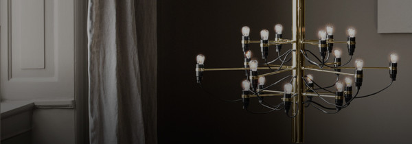
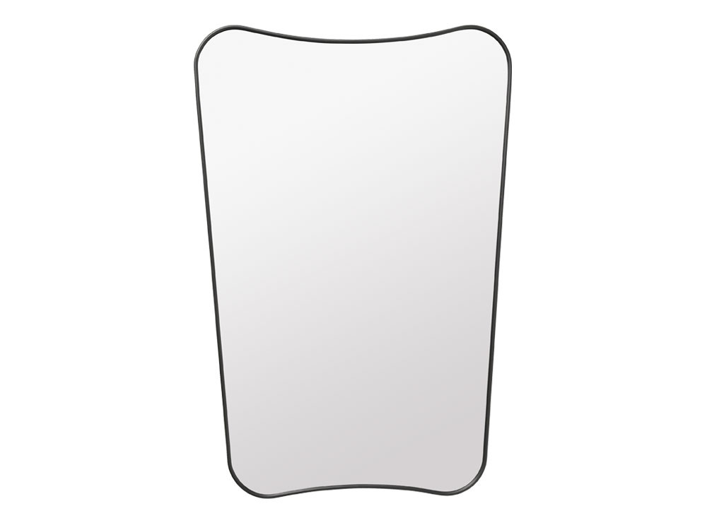
Croissant Lounge Chair | 9602 Floor Lamp | Gio Ponti Mirror
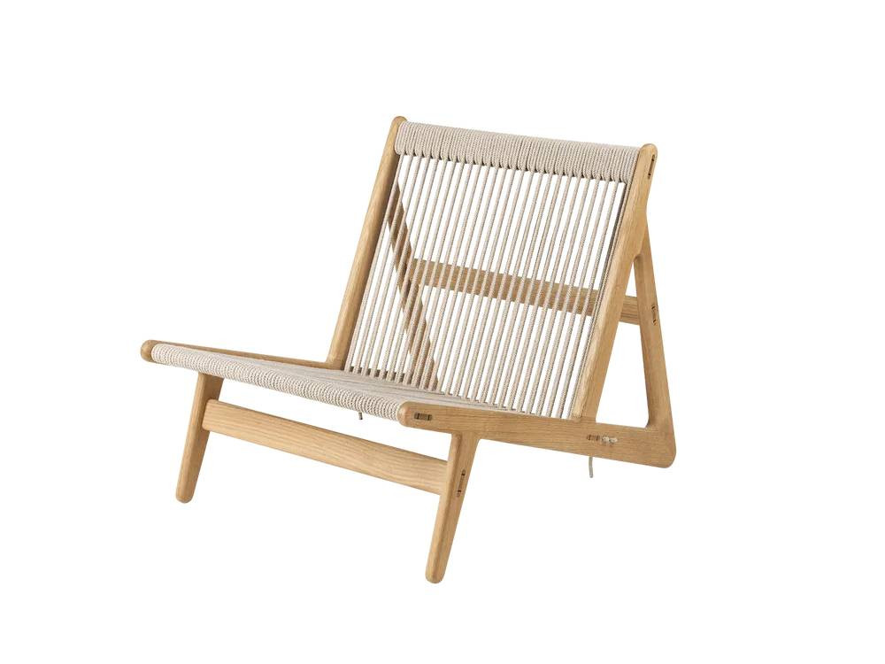
MR01 Lounge Chair | Gravity Table Lamp
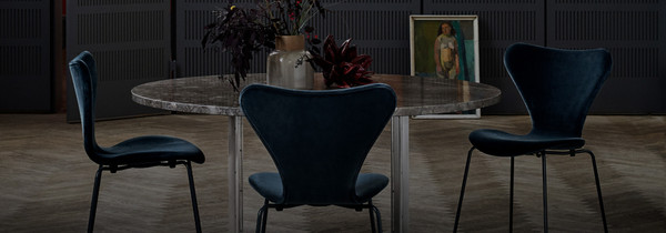
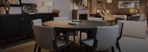
Beetle Dining Chair | Epic Steel Dining Table
Gubi aren’t the first design house to join forces with a major fashion brand. And yet there’s something uniquely sartorial in the way they dress a room. Be it in the drape of the upholstery, the flair of an armchair, or the way a linen lampshade flickers just so. This week, these qualities have come together rather beautifully as part of an exciting collaboration for Copenhagen Fashion Week.
Designed as both the HQ and official showroom space of fellow Scandi brand, Blonde Studio, the apartment has a backstage feel to it. The kind of place that would feel perfect for an after-party, once the sash and sway of the catwalks are done.
Keen eyes will notice the Croissant Lounge Chair strewn in one corner — a lost-n-found style that speaks in ripples and curves — and the perfect counterpart to the more meditative MR01 Lounger. With its cool and cosy vibes, this showroom in Copenhagen becomes a microcosm for the modern Gubi home. A place that feels rich but unfussy. And is all the more lovely for it.
Edra x National Gallery
Edra at The National Gallery of Art, Rome | Mattia Aquila Photography
Museums have garnered a reputation for stuffiness among certain swathes of the population. But what if the way we experienced them was made to prioritise comfort, contemplation or conviviality?
It’s an idea that's beautifully at play in the Time Is Out Of Joint exhibition in Rome’s National Gallery of Art. Designed to subvert a linear vision of history, it saw chiselled sculptures face off with sumptuously soft Chiara Chairs, each wielding equal power in this surrealist inception of past, present and future.
Almost as intriguing as the juxtaposition of style is the invitation they create. Rather than racing from one portrait to another, visitors are encouraged to linger. To gaze upwards. And revel slowly in the art that’s all around.
In many ways, it’s the perfect metaphor for Edra. The design house that thinks like an artist. And seeks to transform our experience of home through furnishings that make people feel like protagonists.
But it’s only when we see the two up close that we notice the real difference between the ephemeral worlds of art and design. While art exists at a distance, to be admired or studied, design is immediately knowable. An essential component that takes the fabric of everyday, and amplifies our possibility for work and play.
Virgil x Vitra
Virgil Abloh through the lens of Joshua Osborne
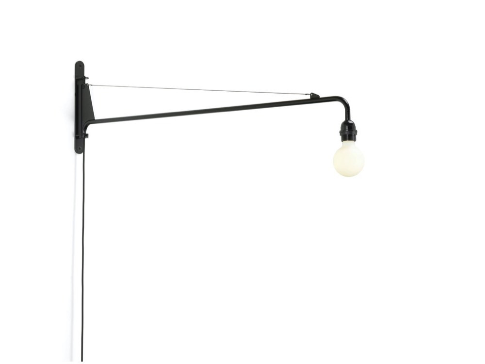
Virgil's take on the Petit Potence Lamp
Eames DKR Wire Chairs
Experimental mashups were also on the mind of the late Virgil Abloh when he set about designing an exhibition for the Vitra Fire Station. In this burgeoning landscape, all that is urban is king — a key concept for understanding the playground into which Vitra’s iconic styles are catapulted. Over the course of a couple of rooms, Eames Wire Chairs can be found adorning retro see-saws, while Jean Prouve’s Petit Potence Lamp has been stripped back with a bare-bones shade.
As any Virgil disciple will tell you, this cultural cross pollination goes beyond just good aesthetics. We like to think it was a way of democratising the classics. Of finding new audiences and overtures, while forming part of Abloh’s overarching attempt to make every creative sphere he touched that little bit more playful.
Hayon x Hyundai
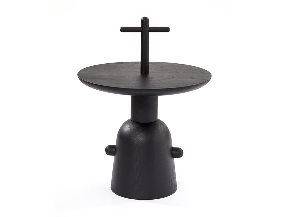
Reaction Poetique Tables | Ro Easy Lounge Chair
Fred Lounge Chair
Leaf Lounge Chair | Explorer Side Tables (in-store only)
Give Jaime Hayon an inch and he’ll take a mile, dreaming up not so much a novel concept, but a brave new world. It’s in this same spirit that he approached the design of the VIP lounges in Seoul’s Hyundai mall. Complete with 10ft tall statues, sweeping sofas and a cacophony of his favourite styles, it’s become an immersive wonderland in which to lounge, eat and shop.
True to form, he's left no nook or cranny to chance, authoring everything from the groovy furnishings to the funky door handles.
In doing so, customers are able to access the kind of escapism that has long been promised by luxury retailers but often ends up being diluted. So while the world ponders the kind of spaces we'll be able to explore in the Metaverse, Hayon has shown that it’s possible to have the same kind of fun in this one.
Karl x Cassina
You probably know Karl for his outfits. The monochrome tailcoats and starched collars that are buttoned up high like a modern-day Dracula.
This sense of rigour is woven neatly throughout the photos of the iconic tome above. Commissioned for the 85th anniversary of one of Italy's most important design houses, Cassina As Seen By Karl saw the stylist get back behind the camera, immortalising in print the designs that meant the most to him.
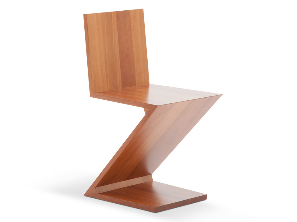
Among the photographed styles are the LC icons by Le Corbusier, as well as Gio Ponti’s Leggera — both of which Lagerfield was rumoured to harbour in his own home. Flip to page 50, and there’s even a Jenga tower of Zig Zag chairs, a beautiful arrangement that perfectly encapsulates Gerrit Reitveild’s search for “simplexity”.
“I’d never worked on a project like this before. To visually reinterpret examples of perfect design was completely new for me.”
Karl Lagerfield
When we first caught wind of the project, we were unsure what the volume would hold. After all, how much more can be done with the icons? And yet in his own fastidious fashion, Lagerfield found a way to surprise us. Bringing a new sense of theatre to the objects we’ve known and loved for so long.
In many ways, it’s the reverse of the Hayon x Hyundai project. A collaboration steeped in tension and an ability to read between the lines.


