Spring Trends: Primaries 2.0
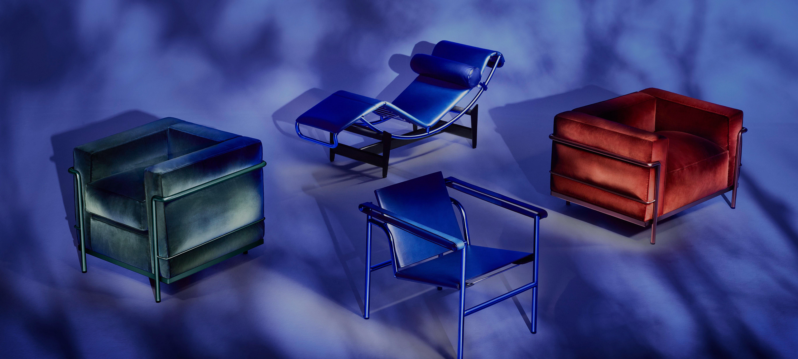
We’ve been leaning towards the brighter end of the spectrum for a while now, decorating-the-home-wise, and 2025 is set to be the year that we learn to live in harmony with primary brights. The year that we work out how to integrate them into our homes with intention, flair and ease. The year of RGB.
The benefits of primarys are wide-ranging. They pull the eye and create a focal point. They’re about impact. They inject energy and personality. They’re just so cheerful, playful and fun.
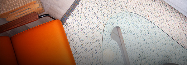
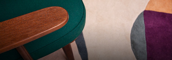
So how to bring out the bold tones of blue, red and yellow (plus a few more primary-adjacent vivid hues such as magenta, emerald green and freshly-plucked-from-a-tree orange)? The 2025 approach is all about thoughtful layering. Treat them like accents, and use their vibrancy to add depth and contrast with small doses – a cobalt chair here, a sunshine yellow rug there, a cherry red cabinet just around the corner, all artfully blended with existing pieces in the home.
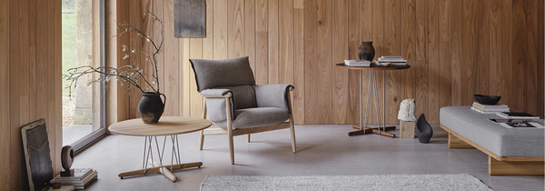
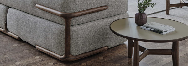
Curate your colours by considering the materials and tones already in the room. Natural materials such as wood, stone or fabrics like wool, boucle or linen immediately lend an air of richness and sophistication to vivid hues, making them timeless and suddenly more approachable. Blending old and new pieces makes for a collection that feels lived in rather than contrived, as does a mix of finishes (some matte, some glossy, some tactile textiles). Primary shades shoud be woven into the fabric of the room, not simply dropped in as jarring new additions.
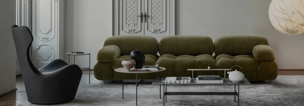
Maralunga Sofa
Bold hues on the biggest stage
The Milan Furniture Fair was awash with not-so-subtle shades from across the colour spectrum. The main standouts were... well... the standouts. Brash brushstrokes of primary tones dominated, with canvases coated in greens, reds, and blues. The accompanying statement? Let your home's hues run wild.
This is the year we fully master the art of living on a day-to-day level with primary brights – integrating them seamlessly with confidence and character. We’ve at last learned how to balance their boldness to create spaces that feel dynamic yet considered.


