


Colour rules that are made to be broken
Decorating rules. They’re there to be broken, right? Yes… if you go about it with intention. The interiors colour rulebook is long, filled with rules that rhyme, rules that are mathematical, rules that confuse and rules that can generally get in the way of creativity and interiors that are truly personal. Here’s how you can break free and still stay stylish and authentic.
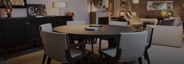
Moroso Collection
Bordeaux Vase by Bitossi
Napoleone Coffee Table by Acerbis
Carefree colour philosophy:
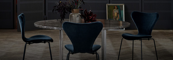
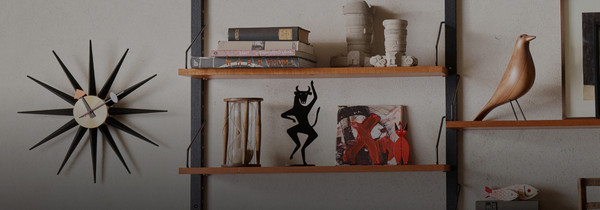
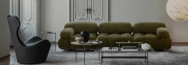
Blue and green can be seen! Or is it red and green… do both! Black and brown, purple and yellow, red and pink… Don't let these old wives' colour tales weigh you down. The trick is the tones – how about sage with a muted teal? Burgundy with olive? Charcoal and cocoa? Dusty violet and lemon? Blush and rust? It’s all about balance, curation and intention, plus a little boldness.
Haller SIdeboard by USM
Zanotta Collection
Dudet Collection by Cassina
Gauging the temperature:
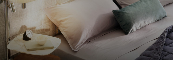
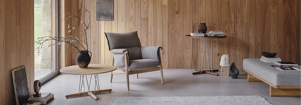
Yes, harmonious palettes are often dominated by warm, or cool, shades. But they really don’t have to be one or the other – a combo of the two adds depth and movement to a space, making it feel dynamic rather than safe. Hot/cold colours that work together? Try warming ochre with cold slate blue, terracotta with lavender, cream with mint, or taupe with dove grey. Bring in tonal shades, gentle tones and tactility to soften the contrast.
Muuto Collection
Basket Sofa by Gubi
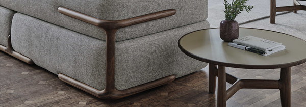
Shape Console Table by Mogg
The darker side of life:
Already got a dark-toned sofa and rug? Deeply-hued curtains and shelves? Don’t be afraid to paint the walls (and ceiling) in similar colours for some sophisticated drama. It will also emphasize texture, materials and other features, making the room cosy and intimate. Sprinkle through small accents in neutral or natural shades to lift the space, break up the shadowiness and stop it feeling oppressive.
If in doubt, aim for visual harmony with repetition, proportion, and/or scale. The chicest interiors often come from knowing the rules, and bending them thoughtfully.
Loafer Dining Chairs by &Tradition
Rose Armchair by Edra
Louis Poulsen Collection