Minimalism vs Maximalism: Where Do You Stand?
It’s become somewhat of a truism to say that we live in exceptionally polarizing times. You’re either a Leaver or Remainer, a smug Samsung-ite or an Apple aficionado. For interior designers, the great debate wages between minimalism and maximalism, two stylistic opposites that perpetually battle for prominence in the hearts of design enthusiasts. Each movement has their stars. In the minimalist corner, there are the mid-century architects and six-figure executives, the latter of which have traded Bentleys and brunch for a serene Scandi existence. In the opposite corner are the maximalists, boasting geniuses like Wes Anderson and Marcel Wanders.
For decades, the cool contours of minimalism have had the upper hand, serving up clean lines and smooth neutrals wherever it can. But with the design pendulum inching in favour of more eclectic patterns and velvet textures, could it be that minimalism has had its day? We’ve called in the experts to have their say as we investigate Minimalism vs Maximalism.
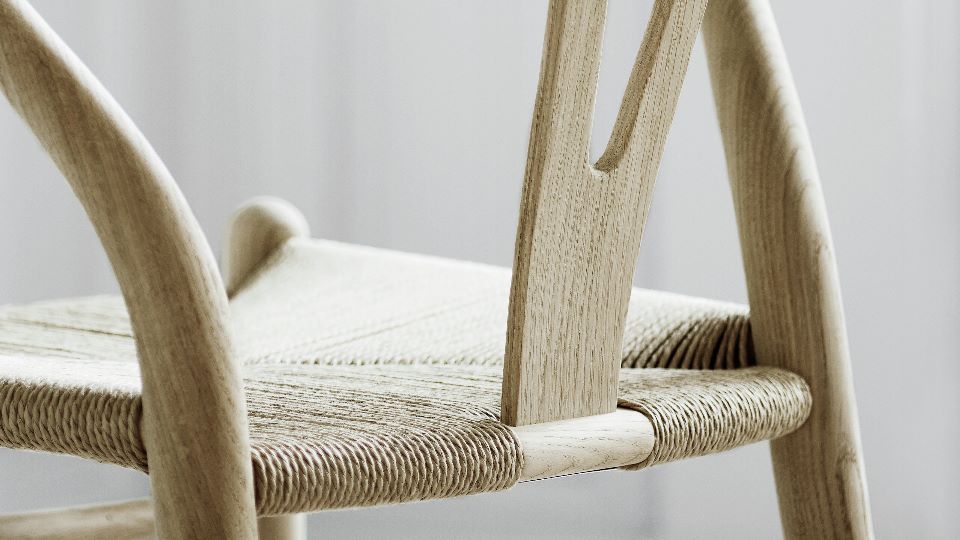
The lyricism of minimalism in the digital age is not hard to understand. It’s a quiet rebellion, a whispered ‘no’ to the modern world that demands excess and clutter. For the Japanese, it’s a necessary antidote to our breathless Western lifestyle. Minimalism forces you to be present in your home. It asks you to zoom in on the little details in a room — to observe how the grain of your wooden table undulates or how an elegantly curved stool allows for perfect posture. Put another way, minimalism is “mindfulness” for the home.
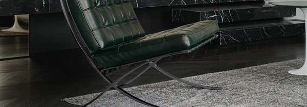
In the Western pantheon of aesthetic, the seeds of minimalism were sewn into the “international style” championed by Jean Le Corbusier and Ludwig Mies Van Der Rohe in the 1950s and 60s. Exhausted by the pomp and excess of abstract expressionists and architects, they sought a new aesthetic, one that looked to industrial materials and monochrome palettes to create clean, free-flowing spaces.
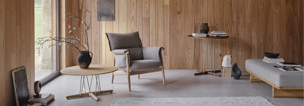
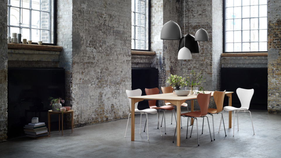
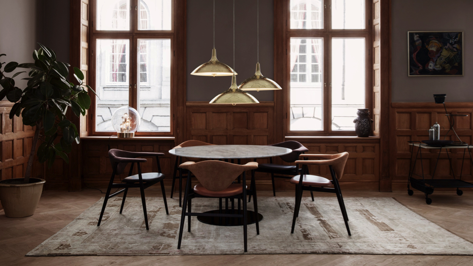
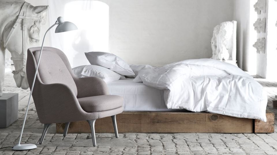
Modern minimalism is a little cosier and often conflated with Scandinavian brands, the Gubi and Fritz Hansen’s of the world. It sanctions the use of warmer, more natural materials —linen, jute and pale woods — while working to create the truest, purest design possible.
But whether it’s expressed through a Wishbone Chair or a Butterfly Stool, the fundamental premise remains the same. A minimal home is one that prompts a physical as well as a visual sense of tranquillity while encouraging you to take pleasure in a few carefully chosen products.
All of which sounds great in theory. What’s more difficult is the execution. How exactly does one strip back a living room while retaining its soul? For Gina Everett (interior guru behind the Create Perfect blog) you need to start by asking yourself a simple question:
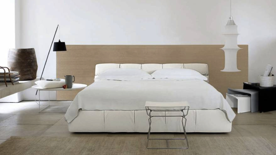
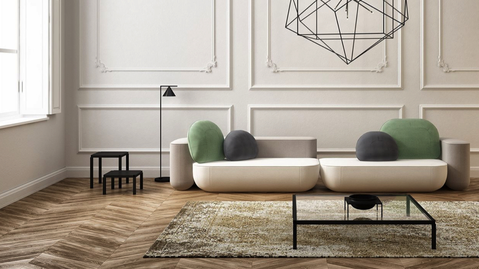
“When embracing minimalism, we ask one question: is this absolutely necessary? This beautifully relaxing style is all about ‘less is more’. It’s not necessarily about creating a plain white box but it’s a concept that focuses on functional design whilst also creating a simple and uncluttered space.
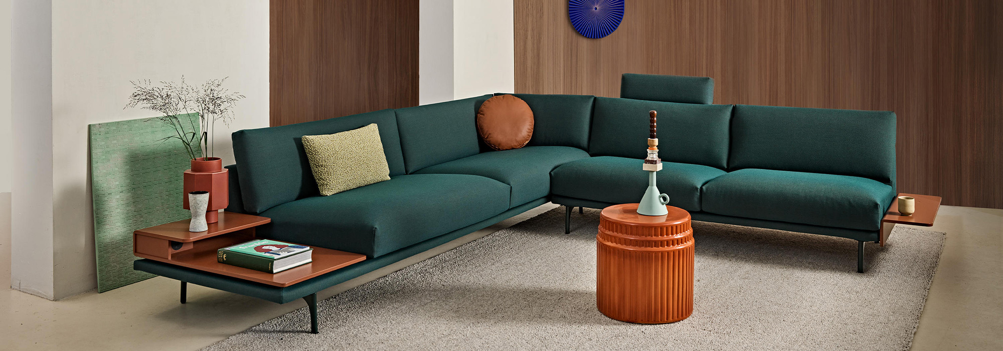
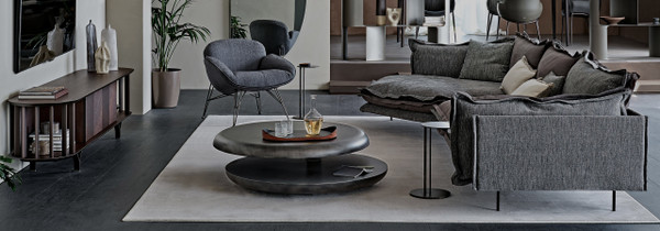
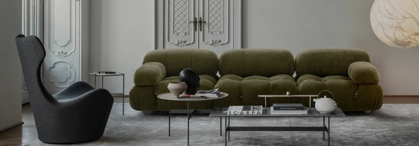
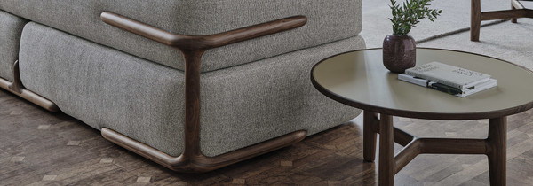
The Okome Sofa by Alias, with its clean lines and lack of ornamentation or accessories, is one great example of this. The palette is another key element, making the room feel serene through the use of two to three neutral colours. When introducing further colour use solid pigments that are easy on the eyes and blend well with neutrals – browns, blues, and greens are good choices.” – Gina Everett, Create Perfect
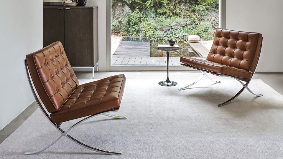
It’s a common misconception that a minimalist lifestyle equates to the deprivation of luxury; one fraying toothbrush, a rickety wooden chair and a house full of echoing thoughts. Instead, it’s more about leaving behind frivolous expenses and investing a few key pieces that will last forever. This could be a design classic from Knoll or a painting you’ve been eyeing up at the local art shop. It’s really up to you. Once you’ve settled on a few important possessions, use colour to help coordinate these elements.
It’s clear that colour and texture are important for achieving a minimalist home but what about when it gets down to the nitty-gritty, the actual slimming of possessions? One of the common complaints about minimalism is that it’s difficult to maintain, especially for those with young or growing families. Finding the answer to this means accepting that minimalism is not merely an aesthetic to be shrugged on, it’s a lifestyle switch, one that requires various tips and tricks to maintain. Thankfully, Natasha at the Interiors NRD has some key advice for overcoming this:
“Whether it is a commercial or residential project, understanding how to design your space is indispensable to ensure the best atmosphere, lifestyle, and happiness for you and your family. Start smart by investing in some functional yet, sophisticated furniture and accessories to allow more space and serenity in your personal spaces.
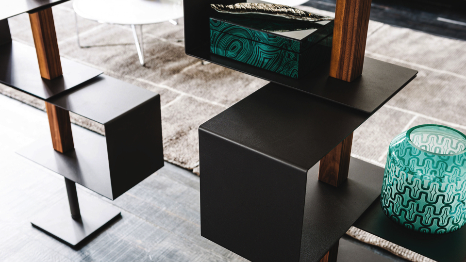
Choose smart shelving units that can recreate into a feature wall to fit books, plants and ornaments too for both homes and offices alike.
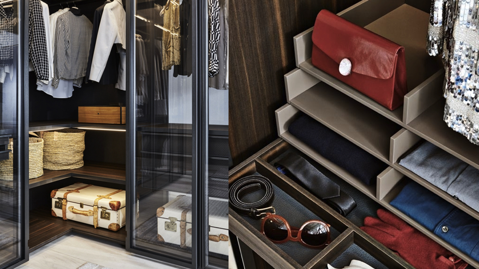
Design or invest in compact closets in your bedroom. If possible invest in eco wood choices, framed out one unified colour to allow for the space to look bigger while keeping things elegant within the room.
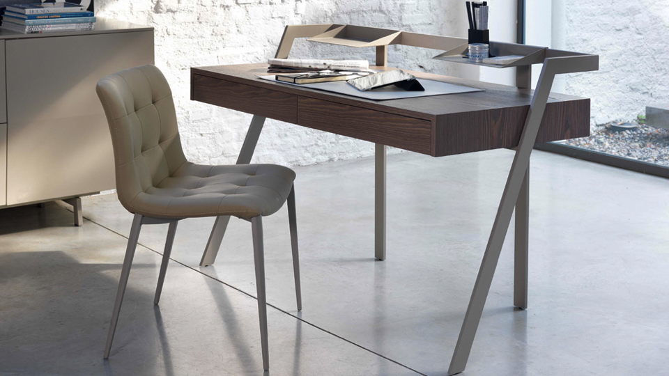
Choose desks with inbuilt drawers or invest in desk accessories, which are helpful and smart for holding letters, cards, invoices and even recipes in the home or office. Whether your choices are large or small, minimalist solutions are beneficial investments in any home, office or commercial space. So, why not opt for stylish ones in 2018?” – Natasha Rocca Devine, aka The Interiors NRD.
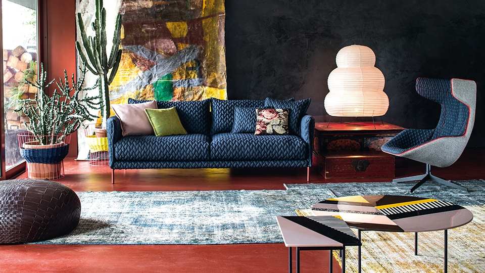
We can, therefore, understand minimalism as a road to tranquility, using artistic restraint and gorgeous materials to create a home that acts as a calming retreat. Maximalism, on the other hand, is a hedonistic holiday in Las Vegas. It is the visual equivalent of Mike Oldfield’s Tubular Bells, a cacophony of loud colours and textures layered together until the desired visual crescendo is reached.
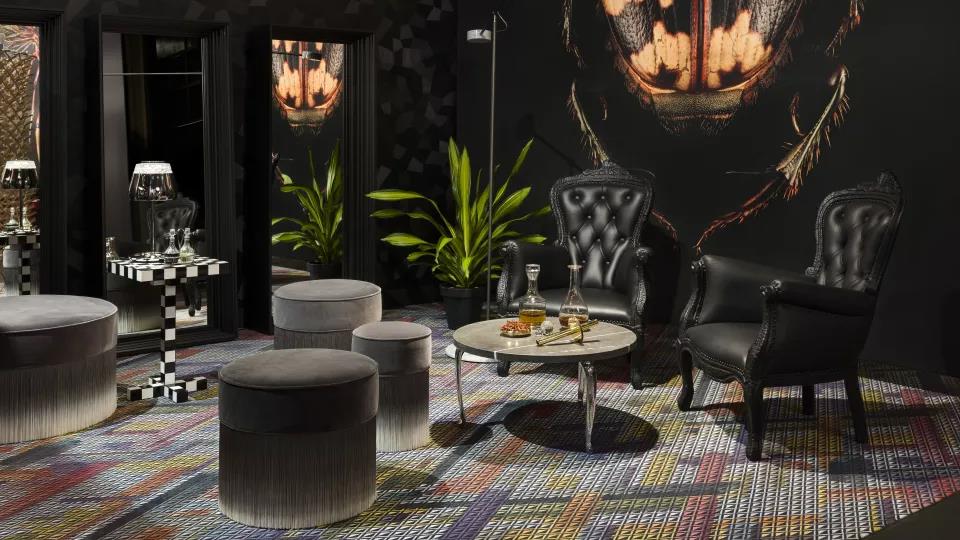
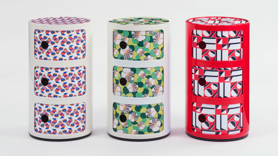
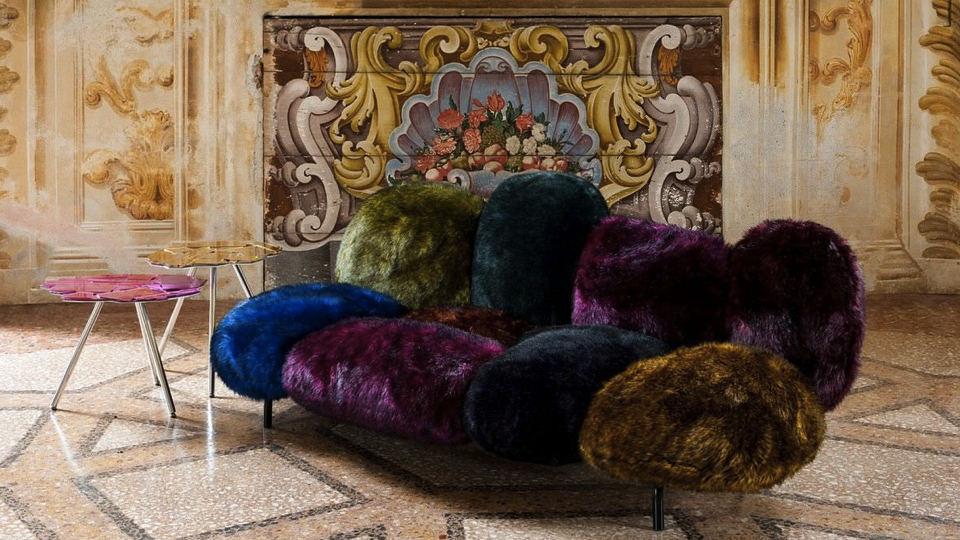
Maximalism holds a permanent sway over the extravagant designs at Moooi and yet its influence was felt in other areas of the hall at this years Milan Design Week – most notably the Double JJ collections at Kartell and the lavish displays at Edra. Its been tipped as the key trend for 2018 by bigwigs at Livingetc and House Beautiful, but why the sudden revival? And where did it all come from?
Whereas minimalism reduces objects to an essential state, aspiring for a sublime purity, maximalism deals in chaos, clashing patterns, colours and textures to an extent in which an overall meaning is obscured by its extreme complexity. This might sound overwhelming in the context of the home, but once you’ve lived in a maximalist house it’s hard to go back. Every inch of your living space becomes a beloved design opportunity. Walls become extravagant murals, floors delight in quirky rugs and boundaries are tested by contemporary furniture that reveals the designer at their most playful. The colours are infectious and there is a true sensory thrill to it all.
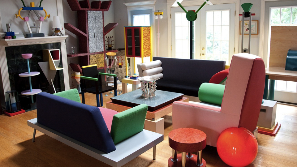
Tracing the roots of maximalism is significantly more challenging than its minimalist counterpart. There is evidence of its influence across all of the creative arts, in almost all cases appearing as a counter-reaction to artistic constraints. In literature, we can see its influences in the over-embellished stream of consciousness writing by Virginia Woolf, in music the multifaceted works of Frank Zappa. In art, it re-emerged with the Neo-Expressionists, who sought to express the human body in an abstract and vivid light. From a design perspective, we can see traces of maximalist impulses in the eclectic work of the Memphis Design Group. Although their palette was mostly limited to binary colours, geometric patterns and clashing combinations created a precedent for eccentricity within the home.
At a time when the evening news feel likes a breathless tour of tragedy, it makes sense that we might want to indulge our inner child with crazy doses of colour and texture. When we sat down with Hayley Gilbert, freelance interiors journalist, she weighed in firmly on the side of maximalism:
“This year the great interiors debate is all about Maximalism Vs Minimalism. Whilst I adore clean, clear lines and minimal clutter, I can’t help but throw caution to the wind and embrace the full-on Maximalist trend. What I love about it is that there doesn’t appear to be any ‘rules’ – the underlying ethos is all about combining bold colour (the more clashing the better) with textural fabrics, retro prints and surfaces with plenty of feel appeal. More is definitely more so choose furnishings and fittings that you love and layer it up. Bring the outdoors in this spring/summer with greens and citrus shades and when the time comes, embrace the autumn/winter season with mustards, plums and metallics. Messy maximalism? Bring it on…” – Hayley Gilbert, Freelance Interiors Journalist.
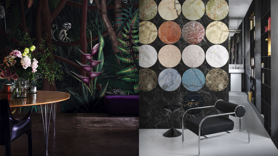
One easy way to embrace maximalism without going overboard is to experiment with wallpaper. It’s a temporary solution but you’d be surprised how it can breathe new life into design classics. Pictured above left is London Art’s Looks In The Forest Wallpaper, which provides a striking backdrop to Fritz Hansen’s Super-Elliptical Table and Cassina’s Cab Armchair. A mixture of lush greenery and potent purples, it’s a print that would transition well throughout the seasons. On the right is London Art’s Lithos Wallpaper, its gorgeous marble effect underlining the tendency for opulence within this of-the-moment trend (check out also Zanotta’s Tempo Side Table).
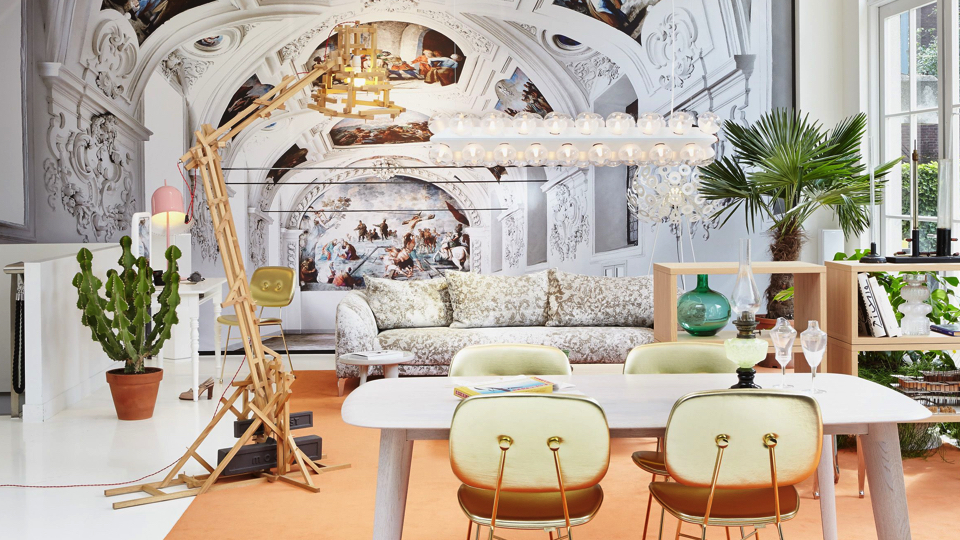
Another option is to experiment with scale. Yasmin Chopin gives us a detailed breakdown of this in an image from one of our favourite Elle Decoration shoots:
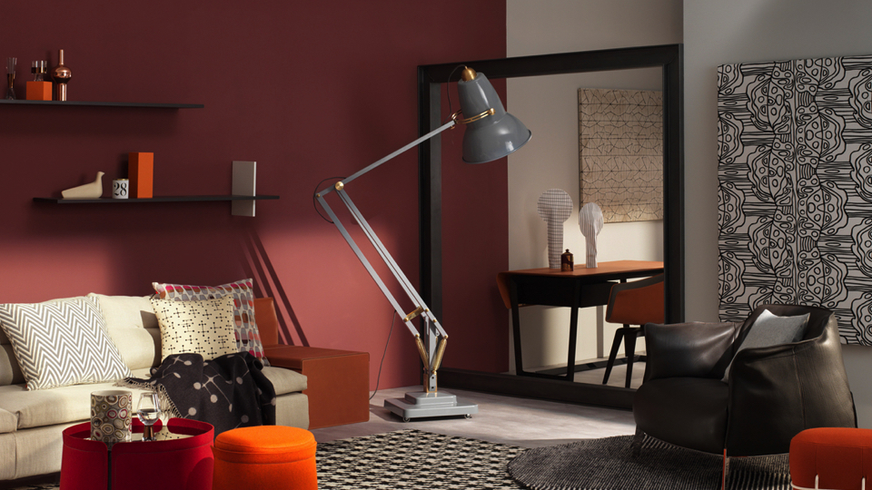
“Maximalism is an interior trend with attitude. It has a generosity of spirit, it’s noisy, sometimes it shouts at you with colour and pattern. With dramatic intent this style makes the heart flutter a little. In a lounge setting maximalism has passion at its core. This image is a studio set styled by Hannah Bort for an Elle Decoration shoot. The black frame acts as a room divider; the gap allows the light from the lamp to shine through (you would approach the study area by an alternative route). The lamp appears as a comic crouching giant, offering light when and where you need it. Quirky design ideas and large-scale pieces are symbolic of maximalism. Also, generosity of colour and plenty of pattern. The warm tones of orange, pink and red hit you first. Then, as the eye adjusts, the beautiful neutrals balance the scene. I like the way pattern adds interest to the styling. It is very bold. It takes courage to mix various geometric motifs with confident wall art. The stylist has got it right. There is a perfect mix of vivid colour with cream, black and grey, a perfect mix of plain and pattern. What would I change? I would replace the throw and arrange some books on the shelves.” – Yasmin Chopin, Interior Designer and Writer
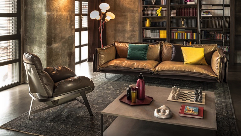
Balancing opposites, whether that’s an oversized Anglepoise floor lamp or a statement Arketipo sofa is key to achieving a maximalist interior. Treat every layer of the room as an opportunity for embellishment and you’ll find just as much pleasure in noticing the details as with a carefully crafted minimal interior.
All of which leads us to our denouement. Which trend has it? While both have a place in our homes, for visual kicks, it has to be maximalism. It’s lavish, indulgent and lets our creative juices run wild. We’re also seeing its influences bleeding over into minimalism in the form of velvets, geometric prints, and warmer woods. Is it as timeless as minimalism? Certainly not. But its playful escapism and precisely what’s needed in today’s political climate. Are you an interior minimalist or maximalist? Be sure to let us know your thoughts on Twitter, Instagram or Facebook.
SHOP MINIMALISM
SHOP MAXIMALISM
