


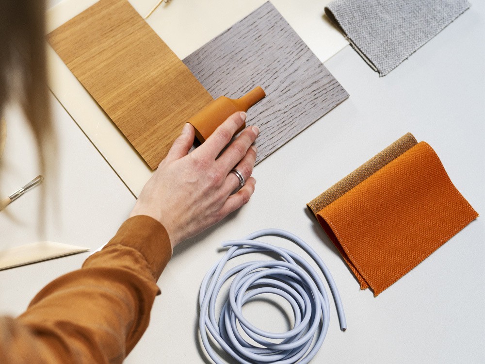
AW21 Colour Stories
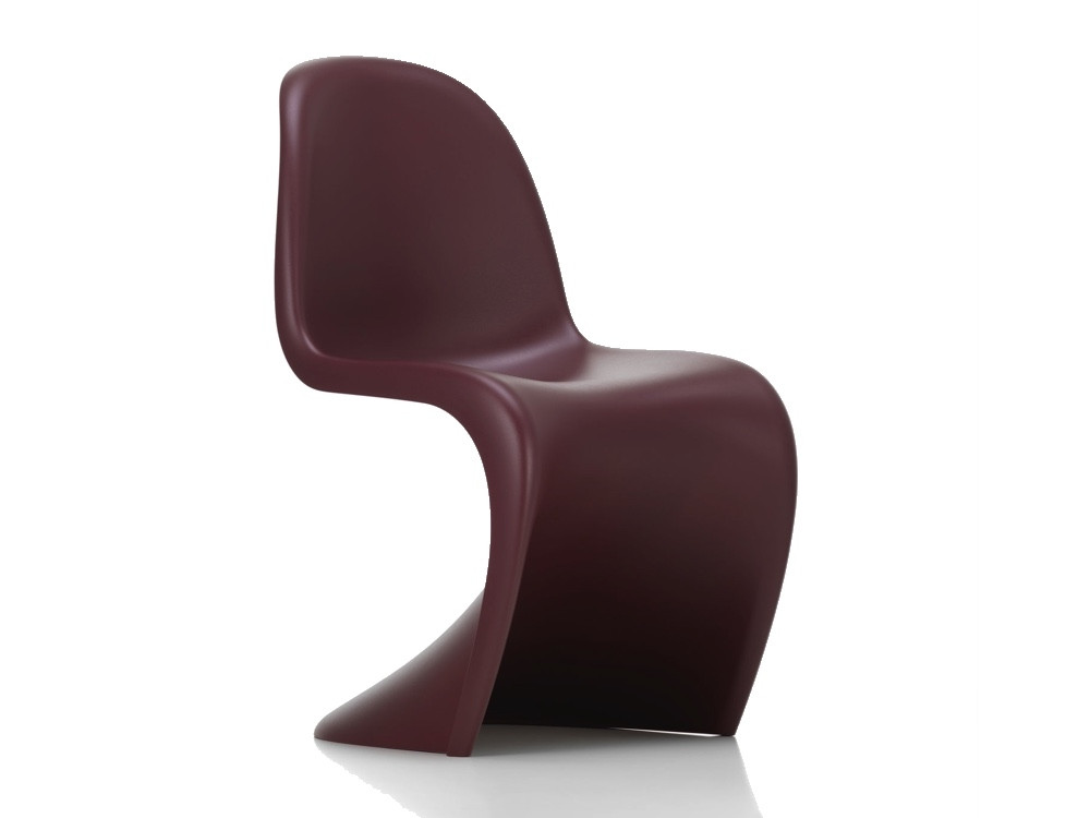
We sit better on a colour we like. Or at least, so went the theory of Verner Panton. As one of the more rebellious Danish designers, he didn’t believe in layering pink with grey, or in the supremacy of bleached Nordic woods. In fact, he often encouraged colouring outside of the lines, altogether.
As ideologies go, it didn’t always win him friends. But it did edge the world towards a new theory of colour. One less invested in following strict rules. And more interested in sparking heartfelt emotions.
It’s in this serendipitous spirit that we unveil our key AW21 palettes: uplifting expressions of colour that seek to help you find new joy in familiar places.
Like any good trend, they can be slipped into existing schemes without fuss or fanfare. Or used as the springboard for a whole new autumnal adventure. We hope you enjoy them. And that you try them. And that each might bring you closer to creating a rich and inviting experience of home this season.
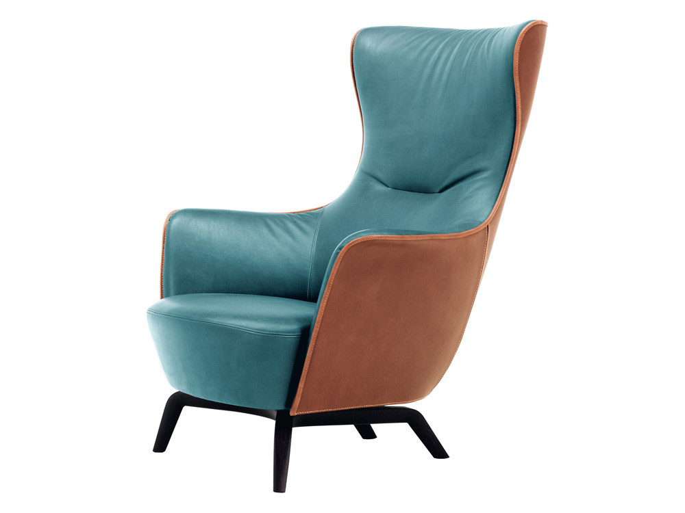
Spiced Pastels
Spiced Pastels | Discover The Full Trend On Pinterest
We’ve often thought of autumn as having it’s own tempo and rhythms. A time of slowing down and gearing up. Of cooling off from summer, only to discover new indulgences come winter. It’s an idea that’s beautifully encapsulated in our first palette.
In mixing soft pastels with rich taupes and oranges, it is both grounding and energising. The chromatic equivalent of a Pumpkin Spice latté. Or a brisk walk on a bright day.
You can think of this palette as the sweet spot between September and October in which all that is lush and leafy becomes gold.
It also finds a way to marry the promise of pastels with some of the rich 70s shades that have become perennially popular. In the interiors above, mood-boosting mustard acts as the interlocutor between seasons. A refreshing detail that lends each home its warmth.
Adapting the look for homes that worship warm neutrals is just as easy. Note how the baby blue Parrot Floor Lamp adds piquancy to this striking Moroccan scheme. Or how the combo of teal and orange breaths new life into Flos’ classic Parentesi lights. Proof, if ever it was needed, that pastels aren’t just for summer.
Potent and playful, this is a feel-good palette. One promises to add spice to any interior. And co-author homes that are rich and full of energy.
Conseta Sofa & Parrot Floor Lamp (in-store only)
Parentesi 50 | Shop Now
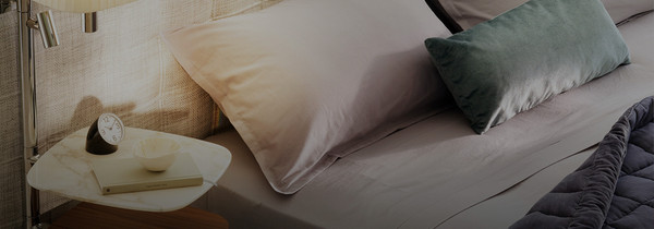
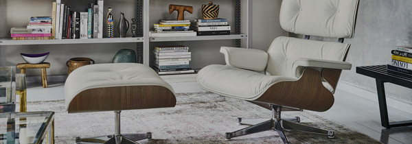
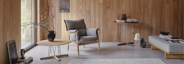
Luxury Whites
Ox Lounge Chair | Discover Fredericia
We make hundreds of decisions every single day: what clothes to wear, which news to consume, how best to tackle a task at work. Fortunately, agonising over what colour to paint your lounge doesn’t have to be one of them. Indeed, of late, we’ve found something immensely restful about going monochrome — selecting one hue and carrying it through your entire decor.
Our luxury white palette is an ode to simplicity. A gentle reminder to collect only the beautiful, useful and necessary.
No shade does this with as much charm or sophistication as white. In its infinite wisdom, it proffers a calm and meditative interior experience, one that will tide you through every season of life. As with any space, the secret to keep it from feeling flat is to underwrite it with robust, truthful textures. Think solid wood dining tables. French cane HEADBOARDS. And tantalising travertine accessories.

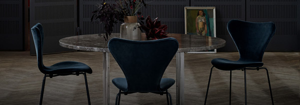
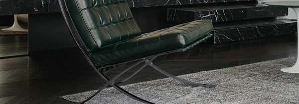
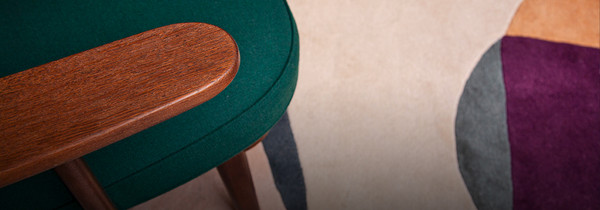
Crimson Pop
Pelican Lounge Chair | See In-Store
Romby Chair | Shop Now
To quote interiors guru, Amy Moore Wong, red decorating favours the brave. It also promises to help you really experience your space. Be it through focused accents. Or all-out cardinal takeovers.
For a case study in crimson, look no further than British brand, Burberry. Woven into the soft folds of every trench coat is a rich red lining. A detail that works to bring out the warmth of the entire palette.
Red works in a similar fashion in our interiors. Emphasising the rich of grains of Porro's Modern Canaletta Walnut storage system. Or as a dramatic background to the soft sheepskin Pelican Chair.
Crimson pop is an invitation to look at the world through rose-tinted spectacles.
You can use red little and often. Or keep it entirely Corbusian, working it into your space as part of a Bauhaus palette of primary hues. The chromatically conservative among us might like to furrow deeper into earth tones like bloodstone and burgundy. While the maximalists will get their kicks from the latest drop of Pantop Table Lamps in eye-popping red.
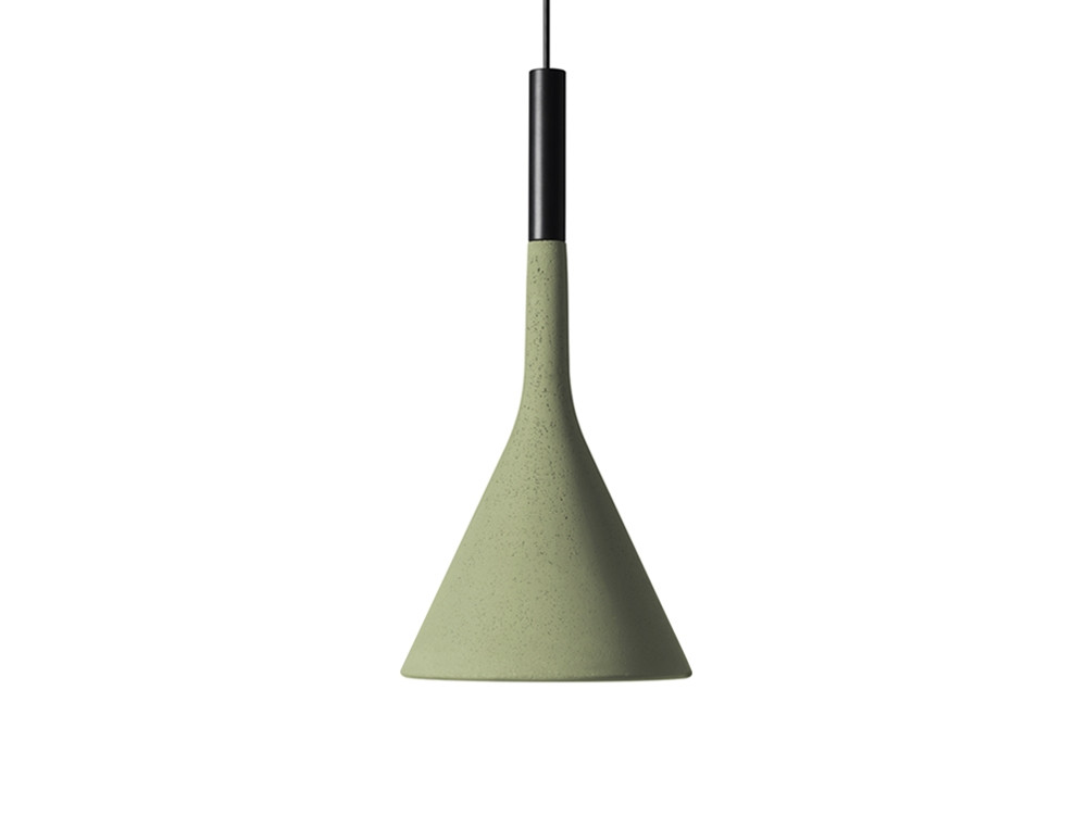
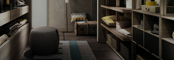
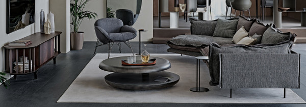
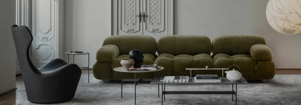
Evergreen Imaginings
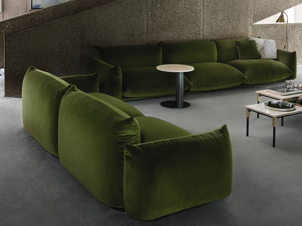
Marenco Sofa | Shop Now
Our evergreen palette is less a trend and more of a lifestyle. An invigorating colour story that seeks to reconnect you to the world and everyone in it. Rather than picking a single shade like celadon, fig tree or sage, we wanted to focus on how you get as much of it into your home as possible, starting with thoughtfully-designed planters.
In 2020, we were reminded of the importance of all things green. Of the healing power of a walk in the woods. And the possibilities that unfold when we just slow down.
The second step in green-ifying your experience of home is to play around with biophilic design: textures and colours that recall nature at it’s finest. A moss-green sofa. A hanging herb garden. Or beautiful rattan baskets and lounge chairs.
We also encourage you to pay attention to the fibres and fabrics you invite in; what will happen to them at the end of their life cycle and whether they are actively contributing to improving the health of the planet. Italian brands like Cassina, Magis & B&B Italia are doing great work here. Collecting ocean waste to transform into premium padding. Or experimenting with textures like Lava Stone, harvested locally from Mount Etna.
Paul Gauguin believed that colour was the language of dreams. A fantastical statement that encapsulated the power of colour to do what architecture alone cannot. At Chaplins, we believe that a little colour can go and long way. And whether you want to feel enlivened or soothed by your living space, we hope you’ll find something to try in the schemes above. As always, you can contact our interior experts for bespoke advice. And shop the looks from all of the trends, below…
Shop our AW21 colour stories